The Layout Advantage of an 8B Model: ERNIE-Image Infographic and Poster Design Practical Guide
1. Why Structured Layout Is Hard for AI Image Generation
Most image generation models struggle significantly with multi-element, heavily constrained layout tasks. This is no accident—structured layout requires a model to simultaneously handle spatial relationships, visual hierarchy, and text alignment across multiple independent objects, and these capabilities fall outside the design scope of many diffusion models.
Specific problems include:
- Chaotic element placement: When a prompt specifies "chart on the left, text on the right," the model often swaps or overlaps elements.
- Missing visual hierarchy: Titles and body text lack font size contrast, causing key information to disappear in uniform visual weight.
- Unstable text rendering: With multi-line text and mixed-language typesetting, glyph distortion or ordering errors are almost inevitable.
- Unbalanced composition ratios: The area each element occupies does not match the primary-secondary relationship described in the prompt.
The root cause is that many models lack a systematic understanding of spatial relationships and instruction structure. To produce professional infographics or posters, a model needs to establish a clear coordinate framework during the composition planning stage—this is precisely ERNIE-Image's core advantage.
2. Foundation of ERNIE-Image's Layout Capabilities
ERNIE-Image uses a single-stream DiT (Diffusion Transformer) architecture with approximately 8B parameters. Its structural design directly benefits layout generation tasks:
Instruction Following
The model achieves a score of 0.8856 on the GENEval benchmark, ranking in the top three among comparable models, with core strengths concentrated in instruction following and composition. This means when you input a complex prompt containing position, hierarchy, and alignment requirements, the model can parse and execute each item in sequence, rather than vaguely "feeling" the overall atmosphere.
Long-Context Prompt Retention
On LongText-Bench, with the prompt enhancer enabled, it scores 0.9733. Structured layout prompts typically require describing multiple regions, various elements, and multi-level visual relationships, resulting in longer prompt text. A high score means the model won't lose key information in the latter half of a prompt—for example, your description of "three-column data comparison in the bottom area" won't be ignored during execution.
Text Rendering
The model supports text rendering in four languages: English, Chinese, Japanese, and Korean. For layout tasks, reliable text generation means chart labels, poster slogans, and data annotations can be generated directly by the model, eliminating the need for manual post-processing.
Technical Specs at a Glance
| Parameter | Standard Mode | Turbo Mode |
|---|---|---|
| Inference Steps | ~50 steps (adjustable 1-100) | ~8 steps (fixed) |
| Speed | Baseline | ~6× faster |
| VRAM | 24 GB | 12 GB |
| Resolution Range | 64-2048px (step 16) | Same as Standard |
Turbo mode is ideal for rapidly iterating on composition concepts—once the layout is confirmed, switch to Standard mode for refined generation.
3. Infographic Design Workflow
The core of infographic design is transforming data or processes into visually readable structures. ERNIE-Image's workflow for such tasks can be divided into four stages.
Stage 1: Data Structure Planning
Before writing the prompt, clarify the logical structure of the infographic. Common types include:
- Data comparison: Side-by-side display of multiple datasets, emphasizing differences.
- Process: Arranged in chronological or step-by-step order, emphasizing sequence.
- Hierarchical: Top-down or center-outward tree structure, emphasizing subordinate relationships.
- Timeline: Horizontal or vertical time axis, marking key milestones.
Structure dictates composition. During the planning stage, answer: Which information is title-level? Which are primary blocks? Which are detail annotations?
Stage 2: Regional Layout
Divide the canvas into logical regions, assigning position and content to each. Using a vertical infographic as an example:
- Top: Title area, occupying 15% of the canvas
- Upper section: Core data visualization (bar chart or pie chart), occupying 40%
- Middle: Process steps or comparison items, occupying 30%
- Bottom: Supplementary notes or data source attribution, occupying 15%
Anchor these regions in the prompt with clear positional vocabulary: "top," "left," "top-right corner," "bottom center," etc.
Stage 3: Text Labels
Write corresponding text labels for each visual element. Note the following constraints:
- Keep each text block within 8 characters; glyph stability degrades significantly beyond this limit.
- When mixing Chinese and English, ensure language consistency within each line—avoid alternating between Chinese and English characters on the same line.
- Wrap text content requiring precise rendering in quotation marks.
Stage 4: Visual Hierarchy
Establish visual weight through relative descriptions in the prompt:
- "Large title text" vs. "small annotation text"
- "Eye-catching red highlight" vs. "light gray background area"
- "Bold lines" vs. "dashed auxiliary lines"
Clear hierarchy is the key to infographic readability.
Complete Example: Annual Data Report Infographic
Professional infographic design, white background, clean modern style. A large black title reading "2025 Annual Report" displayed at the top center. Below, a two-column layout: the left area contains a blue-toned bar chart with the horizontal axis labeled "Q1" "Q2" "Q3" "Q4" and the vertical axis labeled "1M," with the number "156" above the bars. The right area contains a three-line text list, each line preceded by a small circular bullet point, with the items "Revenue Growth," "User Milestone," and "Market Expansion." A line of small gray text at the bottom center reads "Data Source: Internal Statistics." Overall blue-and-white color scheme, clean lines, ample white space, flat design.
This prompt demonstrates: regional division (top/left-right/bottom), positional anchoring (center/left/right), precise text wrapping (quotation marks), visual hierarchy (large/small), and unified color scheme (blue-white).
4. Poster Design Workflow
Posters and infographics have different emphases—posters must convey thematic information, visual impact, and a call to action within limited space. The workflow is likewise divided into four steps.
Step 1: Composition Planning
Poster composition typically revolves around a single visual focal point. Common composition patterns include:
- Center-focused: The main element is centered, with text surrounding it or arranged above and below. Suitable for movie posters and product launches.
- Diagonal split: The canvas is divided along a diagonal into two regions—one for the main image, one for text. Suitable for event posters.
- Three-part: Three horizontal or vertical zones (top-middle-bottom or left-center-right). Suitable for promotional posters with heavy information.
Step 2: Title Placement
The title is the primary visual touchpoint of a poster. Specify in the prompt:
- The title text (wrapped in quotation marks)
- The title position (top center, left vertical, bottom horizontal, etc.)
- The title's visual characteristics (large, bold, specific color)
Step 3: Supporting Information
Dates, venues, registration methods, and other supporting information must be legible but should not compete with the title's visual weight. Control hierarchy through relative descriptions like "small font" and "at the bottom."
Step 4: Visual Elements
Background patterns, decorative elements, and thematic imagery must coordinate with the text information. Describe their style, color, and position in the prompt, and avoid overlapping with text regions.
Complete Example: Tech Summit Event Poster
Event poster design, dark background with a subtle geometric grid texture. An abstract 3D chip pattern with blue-purple gradient lighting placed in the upper-center area. A large white sans-serif title reading "Future Tech Summit" centered at the top. Below the title, a smaller line of white text reading "2026.05.15." In the bottom area, small white text on the left reads "Beijing National Convention Center," and small white text on the right reads "Scan to Register." Overall modern tech aesthetic, predominantly blue-purple tones, symmetrical centered composition, moderate white space, suitable for vertical print dimensions.
This prompt demonstrates: background setting (dark + texture), main element placement (upper center), title hierarchy (large white centered), supporting information (differentiated treatment for date/location/call-to-action), and unified style (blue-purple + tech).
5. Universal Structure for Layout Prompts
Whether infographics or posters, layout-oriented prompts can be decomposed into five core components.
1. Position Keywords
Positional descriptions form the foundation of layout prompts. Common vocabulary:
| Category | Keywords |
|---|---|
| Horizontal | Left, right, center, left-aligned, right-aligned |
| Vertical | Top, bottom, upper, lower, upper third, bottom third |
| Precise | Top-left corner, top-right corner, bottom-left corner, bottom-right corner, dead center |
| Relational | Adjacent to, above, below, beside, surrounding |
The more precise the positional description, the more accurately the model executes. "Top-right corner area" is more stable than "upper right side."
2. Size Hierarchy
Establish visual weight through relative size descriptions:
- Title level: Large, eye-catching, prominent
- Body level: Medium, clearly readable
- Annotation level: Small, fine
Avoid absolute sizes (e.g., "24px")—the model cannot interpret pixel units. Relative descriptions work better.
3. Grid System
Grid descriptions significantly improve layout regularity:
- "Three equal-width columns"
- "Wide left column, narrow right column"
- "2×2 four-panel grid"
- "Three-row list, evenly spaced"
These descriptions provide the model with an implicit coordinate framework, and elements will automatically align according to grid logic.
4. Alignment
Explicit alignment requirements enhance the professional feel:
- "Center-aligned"
- "Left-aligned"
- "Right-aligned"
- "Justified"
- "Evenly distributed spacing between elements"
5. Style Constraints
A unified design style produces more harmonious results:
- Color schemes: "Blue and white," "Black, white, and gray," "Warm tones"
- Design styles: "Flat," "Minimalist," "Retro," "Tech-inspired"
- Detail requirements: "Rounded rectangles," "Thin border lines," "Ample white space"
6. Practical Infographic Prompt Examples
Data Visualization Chart
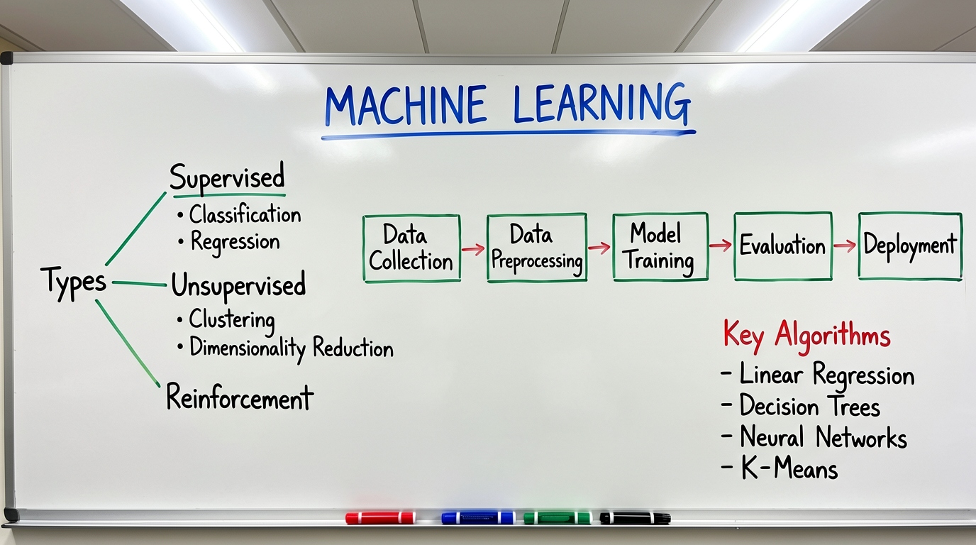
Data visualization infographic, white background. A large black title "Quarterly Sales Comparison" centered at the top. The main area features two bar charts side by side: the left chart is titled "Product A" and contains four blue bars of increasing height; the right chart is titled "Product B" and contains four gray bars with fluctuating heights. The bottom of the charts is labeled "Jan" "Feb" "Mar" "Apr." A line of small gray text at the bottom reads "Unit: 10K RMB." Clean and professional style, suitable for business reports.
Key analysis: Side-by-side layout (left-right), unified label placement (bottom), clear hierarchy (title → charts → annotations).
Process Flowchart
Process flowchart infographic, light gray background. Four steps arranged vertically from top to bottom, each consisting of a circular numbered icon and text description to its right. Step one: a blue circle labeled "1," with text "Requirements Analysis" to the right. Step two: a blue circle labeled "2," with text "Solution Design" to the right. Step three: a blue circle labeled "3," with text "Development & Implementation" to the right. Step four: a blue circle labeled "4," with text "Testing & Delivery" to the right. Blue dashed arrows connect each step. Vertically aligned with uniform spacing, clean and clear.
Key analysis: Vertical arrangement, fixed numbered-icon-plus-text pattern, consistent connecting lines, even spacing.
Comparison Table
Comparison infographic, white background, top title "Plan Comparison." The canvas is divided into two columns: the left column has a light blue background with the label "Plan A" at the top and three lines of text below reading "Low Cost," "Short Cycle," and "Low Risk," each with a green checkmark to its left; the right column has a light gray background with the label "Plan B" at the top and three lines of text below reading "High Cost," "Long Cycle," and "High Risk," each with a red cross to its left. A vertical dashed line separates the two columns. Flat design, strong color contrast.
Key analysis: Two-column comparison structure, background color differentiation, icon-enhanced semantics (checkmark/cross), dividing line marking clear boundaries.
Timeline Infographic
Timeline infographic, white background. A horizontal blue line runs through the center of the canvas from left to right. Four time nodes are distributed above the line from left to right, each consisting of a dot and a text label above it, reading "2020 Launch," "2022 Expansion," "2024 Breakthrough," and "2026 Leadership." Below the line, each node has a corresponding short description in smaller gray text. Overall horizontal layout, time progresses left to right, clean and professional design.
Key analysis: Central axis, alternating top-bottom node arrangement, layered primary/secondary information (node labels above, descriptions below).
7. Practical Poster Prompt Examples
Movie/Performance Poster
Movie poster, vertical composition. Dark night sky background with city silhouette at the bottom. A large moon in the upper center, with moonlight casting a beam of light downward. A solitary human silhouette floats within the light beam. A large white artistic font title "The Night Returner" at the top. Three lines of small white text centered at the bottom: line one "Director: Zhang San," line two "Starring: Li Si," line three "June 2026 – Nationwide Release." Overall atmosphere is mysterious and quiet, blue-black tones.
Key analysis: Vertical format, subject centered upper, title at top, information at bottom, unified atmospheric color palette.
Product Launch Poster
Product launch poster, vertical. Minimalist style, white background. A front-facing render of a smartphone centered on the canvas, its screen displaying a clean app interface with blue theming. Above the phone, large dark blue sans-serif text centered reads "New Release." Below the phone, a smaller line of dark blue text reads "Smart Living Starts Here." At the very bottom, centered, a line of small gray text reads "Official Sale June 1." Clean and sharp overall, ample white space, premium brand aesthetic.
Key analysis: Minimalist white space, product centered, symmetrical top-bottom text, brand tone conveyed through "clean" and "premium" descriptors.
Promotion/Discount Poster
Promotional poster, vertical composition. Vibrant orange gradient background. A large white circular area in the center, with large bold black text inside reading "50% Off." Small black text above the circle reads "Limited-Time Offer." Small black text below the circle reads "All Items." On each side of the circle are small product icons: a sneaker icon on the left and a T-shirt icon on the right. A white horizontal bar at the bottom contains black text reading "Offer Ends June 30." Strong visual impact, eye-catching colors.
Key analysis: Core message ("50% Off") dominates the visual center, circular area focuses attention, supporting information (category icons/deadline) arranged around it, color contrast creates impact.
8. Multi-Panel Layout Strategies
When infographics or posters need to display multiple independent content areas, multi-panel layouts are an efficient choice. The following three strategies each have their own applicable scenarios.
Grid Layout
Equal-division grids are the most regular multi-panel approach, suitable for displaying content of equal rank side by side.
Infographic design, white background, 2×3 six-panel grid layout. Each grid cell contains a circular icon with a line of text label below it. The three cells in the first row are labeled "Security," "Efficiency," and "Reliability." The three cells in the second row are labeled "Intelligence," "Energy Saving," and "Eco-Friendly." All icons are the same size, neatly arranged, with equal spacing. Flat design, blue-green tones.
The key to grid layout is "consistency"—icon sizes, text sizes, and spacing should all be uniform.
Asymmetric Layout
Asymmetric layouts break balance, suitable for scenarios requiring emphasis on a specific region.
Infographic design, white background, asymmetric layout. The left side occupies two-thirds of the canvas and contains a large data chart titled "Annual Overview"—a line chart with a blue line showing an upward trend. The right side occupies one-third of the canvas and contains three vertically stacked data summaries, each with a number and a corresponding label: "1.56M," "89%," and "32 Items." A thin gray line separates the left and right sides. Modern, clean style.
Asymmetric layouts require clear ratio descriptions (two-thirds/one-third) and dividing elements (thin lines).
Magazine-Style Layout
Magazine-style layouts emphasize the visual rhythm of interleaved text and images, suitable for content-rich scenarios that need guided reading order.
Magazine-style layout design, white background. A full-width hero image area at the top with a dark tech-themed background, overlaid with a large white title "Tech Trends." Below, a two-column layout: the left column is wider and contains a body text paragraph and a three-item bullet list, each item with a blue dot to its left; the right column is narrower and contains a small product image with a line of small gray caption text below it. At the very bottom, a full-width dark background bar contains white text reading "Learn More – Visit Our Website." Overall reading flow from top to bottom, with clear layers.
The core of magazine-style design is reading flow—guiding the eye through structural shifts of full-width, split columns, and back to full-width.
9. Text Best Practices in Layout
Text is the most error-prone component in structured layout. The following practices are distilled from hands-on experience.
Text Length Control
Keep each line of text requiring precise rendering within 8 characters (including punctuation). Beyond this length, the probability of character distortion and ordering errors increases significantly. For larger information volumes:
- Split long text into multiple lines of short phrases.
- Use abbreviations or shortened forms.
- Place detailed descriptions in areas that don't require precise rendering (the model will generate placeholder text rather than exact content).
Quotation Method for Precise Text
Wrap text that needs precise rendering in Chinese quotation marks or English double quotation marks to explicitly signal to the model that this is text to be rendered literally, not a style description.
For example:
- Correct:
Title text "Annual Summary" - Incorrect:
Title text Annual Summary
Unquoted text is easily interpreted by the model as a style keyword rather than literal content.
Font Style Description
While the model does not directly support font name specification, style descriptions can guide the output:
- Chinese calligraphy feel: "Brush calligraphy style"
- Modern sans-serif: "Sans-serif font," "Clean and sharp"
- Formal business: "Serif font," "Traditional and elegant"
- Tech style: "Tech-inspired font," "Geometric letterforms"
Text Positioning and Overlap Avoidance
Text and image element overlap is a common problem. Prevention methods:
- Define independent text regions: "A dedicated bottom horizontal bar for text"
- Use background differentiation: "Text on a white background bar"
- Describe spacing: "Appropriate spacing between text and image"
Multi-Language Typesetting
ERNIE-Image supports text rendering in four languages (English, Chinese, Japanese, Korean), but when mixing languages:
- Separate languages by line as much as possible; avoid alternating Chinese and English within the same line.
- Each line of text is still subject to the 8-character limit.
- Chinese, Japanese, and Korean text rendering stability is slightly lower than English.
10. Resolution and Aspect Ratio Selection
Different layout types suit different canvas dimensions. ERNIE-Image supports a range of 64-2048px (step 16), and the following preset sizes have proven effective through practice.
Recommended Infographic Sizes
| Use Case | Recommended Size | Ratio |
|---|---|---|
| General infographic | 1024×1024 | 1:1 |
| Vertical infographic (recommended) | 848×1264 | ~2:3 |
| Horizontal infographic | 1264×848 | ~3:2 |
| Long infographic / scroll | 768×1376 | ~9:16 |
| Wide infographic | 1376×768 | ~16:9 |
Vertical ratios (848×1264 or 768×1376) are better suited for multi-section, multi-level infographics, as the extra vertical space naturally accommodates title, chart, list, and annotation elements.
Recommended Poster Sizes
| Use Case | Recommended Size | Ratio |
|---|---|---|
| Standard poster | 848×1264 | ~2:3 |
| Mobile screen poster | 768×1376 | ~9:16 |
| Banner poster | 1376×768 | ~16:9 |
| Square poster | 1024×1024 | 1:1 |
Movie posters and event posters typically use vertical 2:3 or 9:16 ratios; social media distribution suits 1:1 or 16:9.
Aspect Ratio Declaration in Prompts
Stating the canvas ratio at the end of the prompt helps the model adjust composition:
- "Suitable for vertical print dimensions"
- "Square composition"
- "Widescreen horizontal layout"
Combined with the actual output resolution, the effect is enhanced.
11. Limitations and Best Practices
Current Limitations
- Text length: The 8-character-per-line limit for precise text is a hard constraint. Beyond this, text must be split or accept uncontrollable rendering results.
- Complex graphics: While the model can generate basic charts like bar charts, line charts, and pie charts, data precision cannot compete with professional tools. Charts are suitable for conceptual display, not precise data presentation.
- Multi-element coordination: When the number of independent components exceeds 8-10, some element positions may deviate. Consider splitting complex layouts into multiple images for separate generation and post-processing assembly.
- Font consistency: The model does not guarantee that all text in a single image uses the same font. Strict font uniformity requires post-editing.
Best Practices for Higher Success Rates
Use the prompt enhancer: Enabled by default. It expands short prompts and fills in contextual details the model needs. However, when precise text control is required, disable the prompt enhancer to prevent the model from modifying your specified text content.
Guidance scale control: The default guidance scale is 4, with a range of 0-20. For layout tasks, keep it between 3-5. Beyond 8, oversaturation can cause color distortion that interferes with text readability.
Use Turbo mode for composition exploration: Use Turbo mode (~8 steps) to quickly try multiple layout concepts, then generate the final version in Standard mode (~50 steps) once the composition is confirmed.
Iterative refinement: Don't try to nail every detail in a single prompt. First establish the overall layout (title position, regional division, primary color), then progressively add specific elements and data. Focus on one dimension per iteration.
Quote precise text: Emphasized again—text requiring literal precision must be wrapped in quotation marks, or the model will treat it as a style description rather than literal content.
Avoid overloading: Keep the number of independent elements per image within 8. Beyond that, consider whether the information can be split into multiple charts.
12. Summary
ERNIE-Image's 8B parameter scale demonstrates layout capabilities disproportionate to its size. Its single-stream DiT architecture delivers instruction-following strength (GENEval 0.8856) and long-context retention (LongText-Bench 0.9733), making it a practical tool for infographic and poster design.
The core methodology for structured layout can be summarized as:
- Structure first, details later—Define regional division and visual hierarchy before filling in specific elements.
- Precise positional descriptions—Anchor each element with clear position keywords; avoid vague relative descriptions.
- Control text length—Precise text within 8 characters, wrapped in quotation marks.
- Leverage grid thinking—Constrain model output through descriptions of grids, alignment, and even spacing.
- Iterate rather than one-shot—Explore layout concepts in Turbo mode first, then refine.
As model capabilities continue to evolve, AI-generated structured layouts are transitioning from "usable" to "well-usable." Understanding its capability boundaries and mastering effective prompt structures are key to unlocking the value of this tool.
This article is based on hands-on testing with ERNIE-Image Standard and Turbo modes. All prompt examples can be used directly or adjusted according to specific needs.