Running Ernie_Image on 12GB VRAM, with speeds nearly catching up to Z-Image
Baidu has released an 8B open-source text-to-image model called Ernie_Image. It’s said to be especially well suited for structured visual tasks such as posters, comics, storyboards, and multi-panel compositions, with strong long-text rendering capabilities.
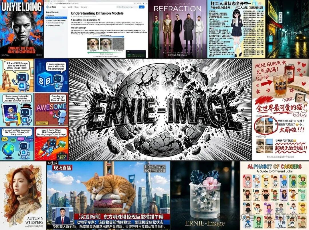
It’s just that, since it’s Baidu, its products have historically had bad luck (or bad timing/strategy). This time was no different: only a few days after release, it ran straight into the launch of GPT Image 2, and all the attention got completely overshadowed...
Still, as many people probably know, Baidu has long been one of the early pioneers of AI in China. Baidu Paddle was actually one of the platforms I used the most when I first started playing around with AI image generation. So now that this old friend has released a new model, I had to give it a try and see how it performs.
Officially, they say this 8B model can run on a 24GB GPU. I only have a machine with a 12GB GPU, but since it can even run LTX2.3, this one absolutely had to run too!
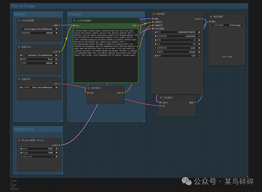
You can just use the official ComfyUI workflow, add a VRAM optimization node, and that’s enough. The official workflow can even include a prompt optimization model:
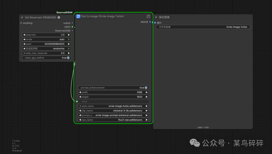
But to save memory, we can remove that prompt optimization process. You can write prompts yourself, or use DeepSeek to help optimize them first, and then use them here. That way, you don’t even need the VRAM optimization node and can run it directly:
Posters
Now let’s see how the outputs look when running it locally.
Prompt
A Chinese infographic poster with the theme: How a Cup of Coffee Reaches Your Hands. The style should be premium information design, combining a science-education feel with commercial visual appeal. The layout should be clear, with path arrows, data boxes, icons, simple illustrations, and modular cards. The color palette should center on coffee brown, creamy white, and ink black, with small copper accents. The poster should balance text and graphics, contain a lot of information, and still look beautiful. The poster must fully include the following content: How a Cup of Coffee Reaches Your Hands 01 Planting Altitude: 1200 to 2200 meters Suitable temperature: 18°C to 24°C Harvest season usually concentrated from November to March of the following year 02 Processing Natural Washed Honey Process 03 Roasting Light roast brighter Medium roast more balanced Dark roast richer 04 Grinding Pour-over coarser Espresso finer Cold brew medium-coarse 05 Extraction Coffee-to-water ratio Water temperature Time all affect flavor Flavor keywords floral / citrus / nuts / caramel / chocolate / smoky Every sip you drink comes from a chain of precise choices Small text at the bottom: Suitable for introductory coffee science education and in-store display. Focus on stress-testing long infographics, numbers, temperatures, numbering, short descriptions, slash-separated flavor words, and multi-module layouts. Make it look like a high-quality exhibition board, not a classroom PPT. If you want to upgrade these 10 sets into a real stress-test suite, I suggest directly making three difficulty levels next: Level 1, pure Chinese main titles with a small amount of body text. Level 2, mixed Chinese-English layout with prices and multiple modules. Level 3, ultra-long body text with tiny copyright information at the bottom plus complex table-like layouts.
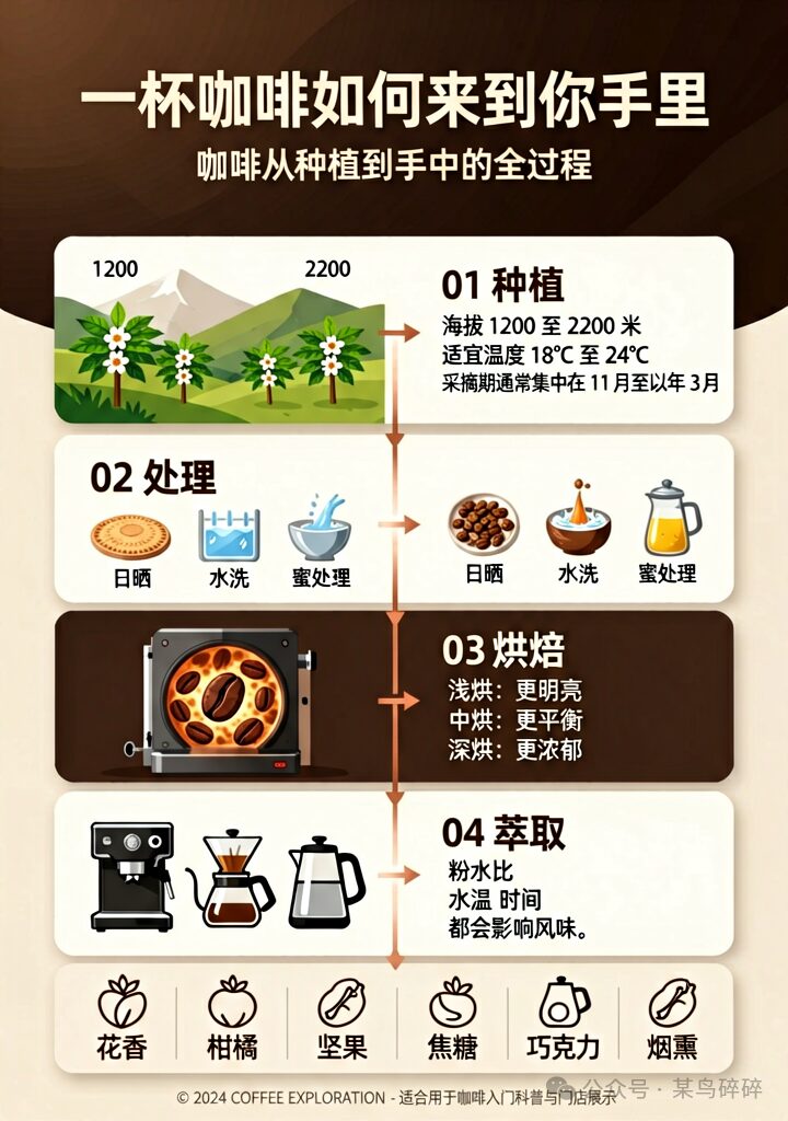
I copied this prompt from online. At first glance, the result looked okay. But it turns out this prompt was originally used on GPT-Image2, and compared with that, this Ernie-Image feels a bit underwhelming...
Let me copy another one for a product showcase design:
Prompt
A premium skincare e-commerce hero poster for a product called Cultivation Stability Mask. The overall style should be clean, light-luxury, and strongly science-skincare oriented. At the center of the image is an individually packaged high-end facial mask. The mask sheet is made of natural silk or bio-fiber material, with a rich, serum-soaked appearance, and subtle reflective droplets and flowing serum sheen visible on the surface. The packaging pouch should have a semi-transparent frosted texture, faintly revealing the milky white mask sheet and pale gold essence inside, with delicate gold-foil embossing along the edges. The background should be a soft gradient from creamy white to warm gray, decorated in parts with transparent flowing liquid lines and microscopic molecular structures (ceramide microcapsules, liposome-like spherical particles), creating a technological aesthetic of active ingredient penetration.

The poster must include the following copy, with clear hierarchy and an elegant sans-serif typeface:

Main title (large, in gold foil or dark gray): Cultivation · Stability Mask

Functional tagline (medium size, dark gray, arranged horizontally or centered): Barrier Repair | Soothe Redness | Smooth and Radiant

Upgrade badge (small golden badge or label): 2nd-Generation Upgraded Formula

Core ingredients (small text, arranged in two lines): Ceramide · Panthenol B5 · Centella Extract · Microcapsule Liposomes

Suitable users (light gray label or plain text): Sensitive Skin · Tired Sleep-Deprived Skin · Seasonally Unstable Skin

Price information (large prominent dark digits + small unit): Limited-Time Price 229 Yuan

Gift list (medium size, using separators or icons): Buy 1 Get 3 — Free Cleanser 15ml · Free Serum 5ml · Free Cream 10g

Small text in the lower left corner (very light gray, very small font): Actual results may vary from person to person; please use consistently

Overall composition: The mask package should be placed slightly below the center of the image, slightly tilted, showing front and side dimensionality; above it are the main title and functional tagline; ingredient and target-user information should be arranged vertically on the left or right; the price and gifts should be concentrated in the lower area as a promotional visual focal point, but remain restrained and avoid looking overly salesy. Lighting should be soft, with highlights and slight shadows, and the molecular decorations in the background should appear faintly. The overall look should feel premium, calm, and textured.
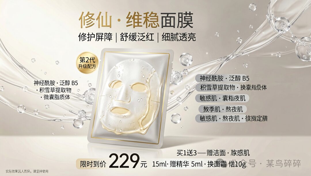
Let’s try something more complex:
Prompt
A high-resolution horizontal or square-format science-education style digital illustration with the theme “Internal Structure of an Animal Cell,” presented from a semi-perspective cross-sectional view for educational display. The overall palette should feel fresh and natural, with soft blue-purple cytoplasm as the background. Various organelles should be drawn in bright, easily distinguishable colors, with clear Chinese label lines and a legend.

Slightly right of center in the image is a large spherical nucleus. The nuclear envelope is a double-membrane structure, with the surface covered in nuclear pore complexes. Inside the nucleus, a dark purple chromatin network and one or more dark red nucleoli should be visible. Surrounding the nucleus is a Golgi apparatus composed of multiple stacked flattened sacs, crescent- or arc-shaped, colored orange-yellow, with small secretory vesicles visible along the sac edges.

Near the nucleus there should be a small amount of rough endoplasmic reticulum in elongated or branched forms, with dense dark small particles (ribosomes) attached to the surface, colored light green. The smooth endoplasmic reticulum should be tubular and branched, without particles, colored light blue. Scattered throughout the cytoplasm are many free dark blue dot-like ribosomes. Several oval mitochondria should be distributed throughout the cell, with double membranes and inward-folded cristae. The outer membrane should be smooth, while the inner membrane and cristae are shown in dark red or purple, with indications of ATP synthase particles.

Near the inner side of the cell membrane, the cytoskeleton’s microfilaments (thin filament-like structures) and microtubules (thicker tube-like structures) should interweave into a network, rendered in semi-transparent light gray. The cytoplasm should also contain several lysosomes (magenta-purple) and peroxisomes (yellow-brown) of varying sizes. Two centrioles should be arranged perpendicular to each other near the nucleus, appearing as short cylindrical structures. Sparse microvilli protrusions should be visible on the cell surface. The outermost layer of the cell should be the cell membrane, represented by a semi-transparent light gray double line with a clear boundary.

In the lower right or lower left corner, place a simple legend box with a white background and black text, listing the main organelle names and corresponding colors: nucleus (purple), nucleolus (dark red), nuclear pore (labeled), mitochondria (red), endoplasmic reticulum (green), Golgi apparatus (orange), ribosome (blue), lysosome (magenta-purple), centriole (gray), cell membrane (gray double line), etc. All label lines should be thin black lines ending in dots that point to the target structures, and the text should use a clear sans-serif font. The background should be pure white or very light gray to ensure clarity in both print and on-screen display. The overall style should combine scientific accuracy with intuitive educational clarity.
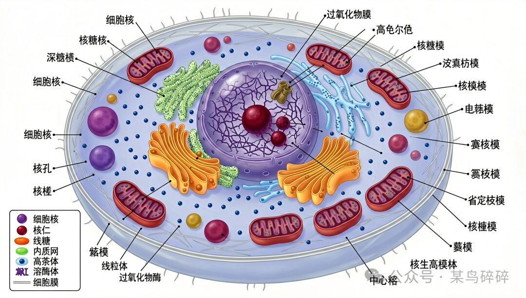
I rerolled it many times, but the results weren’t very good. There were lots of misspelled words and many incorrectly indicated parts...
Character Generation
Prompt
A stylized cinematic side-profile medium shot portrait of a young Chinese 18 years old Girl with sleek dark hair in a tight low bun, wearing a crisp white ruffled-collar shirt, eyes closed in serene contemplation, standing against a moody, light twilight sky with layered misty mountain silhouettes in the background, extreme high-contrast split neon lighting: 95% of the scene bathed in deep, saturated cool cyan-blue ambient light (dim, moody, low-key), with a sharp, intense, vivid neon pink-orange rim light tracing her facial profile, neck, and collar, creating bold color blocking and a surreal, artistic aesthetic, minimalist composition, high-fashion editorial, 8K, ultra-sharp focus on subject, moody desaturated blue tones, dramatic contrast, atmospheric depth, tranquil introspective vibe, dark atmospheric background, no overexposure, stylized color grading, neon rim light glow, low-key cool fill light.
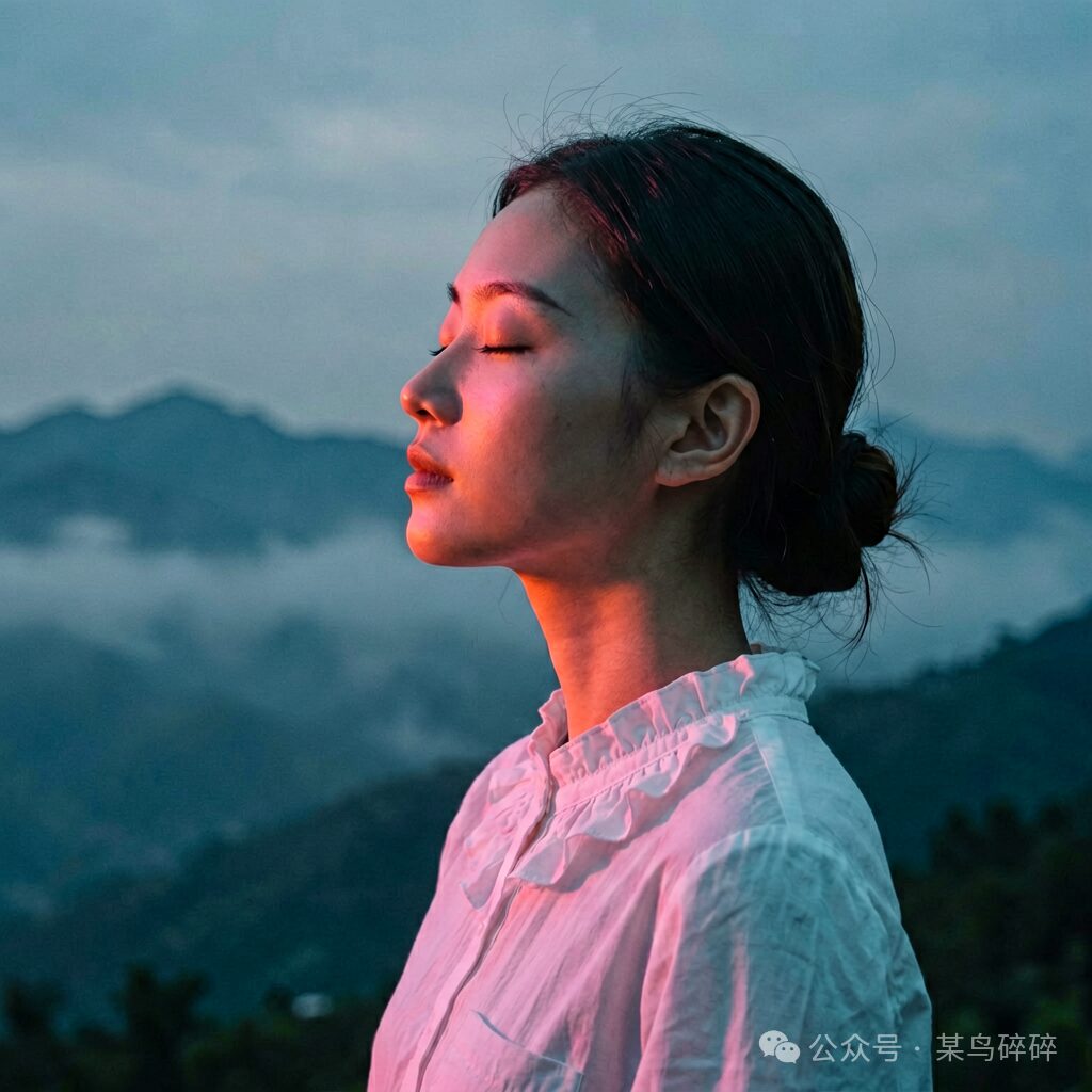
The character generation doesn’t feel especially refined. The skin texture is way too grainy... But if you insist that this is what gives it a sense of realism and removes that overly polished AI look, I guess that’s not entirely unreasonable either...
Here are a few more examples:
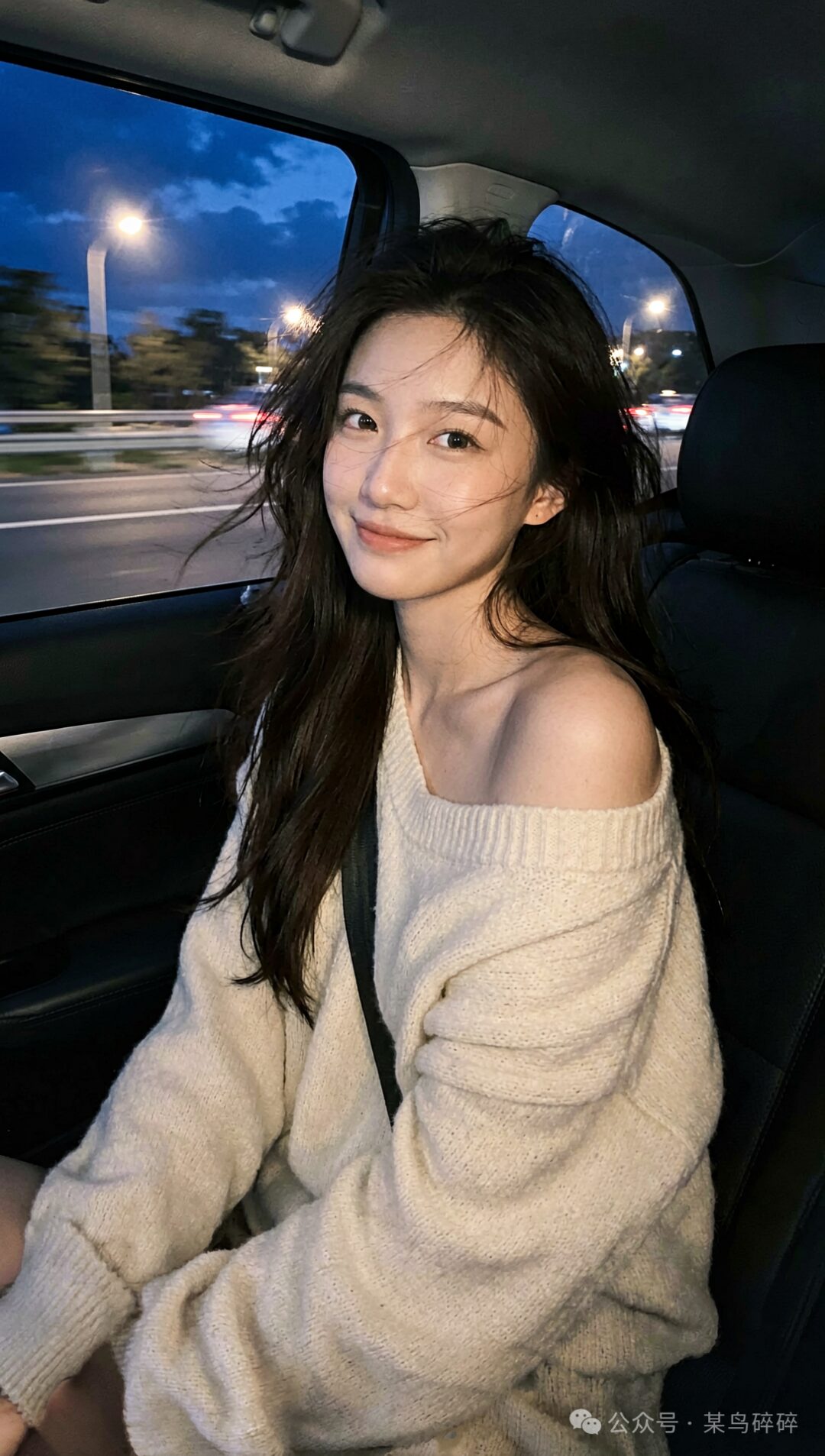
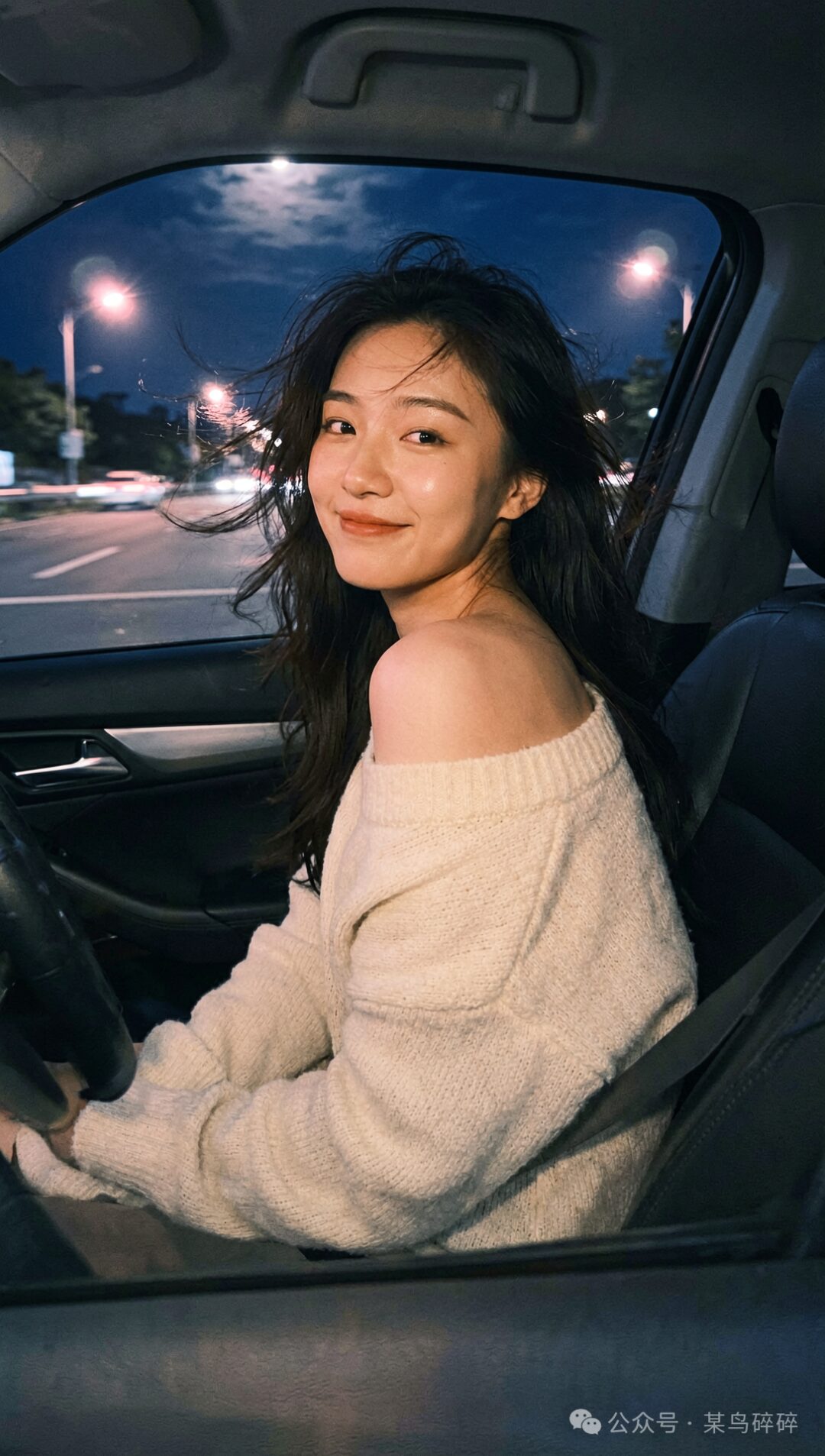
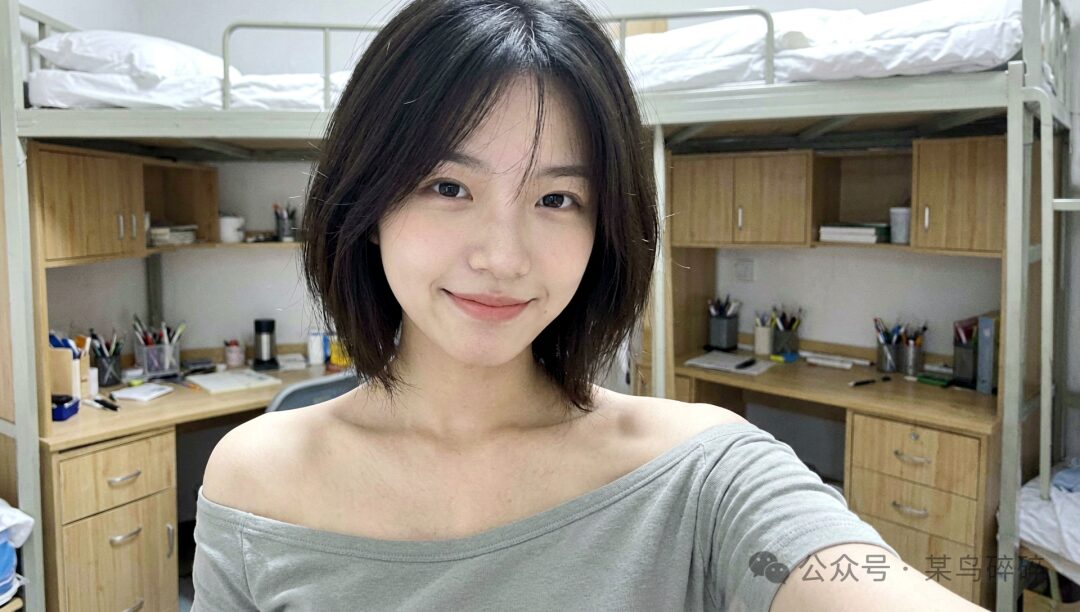
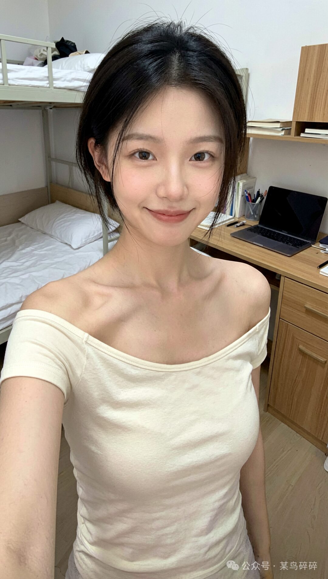
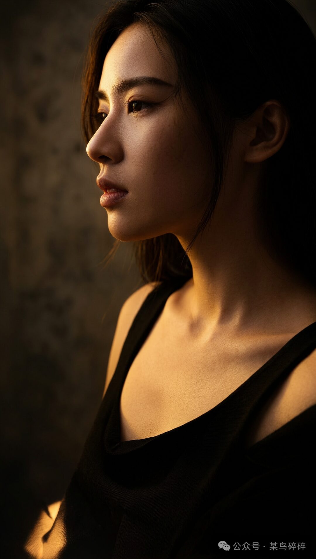
How should I put it... it has a bit of that early Stable Diffusion era feel, and sometimes the body structure still collapses...
Let’s See How It Does with Comics
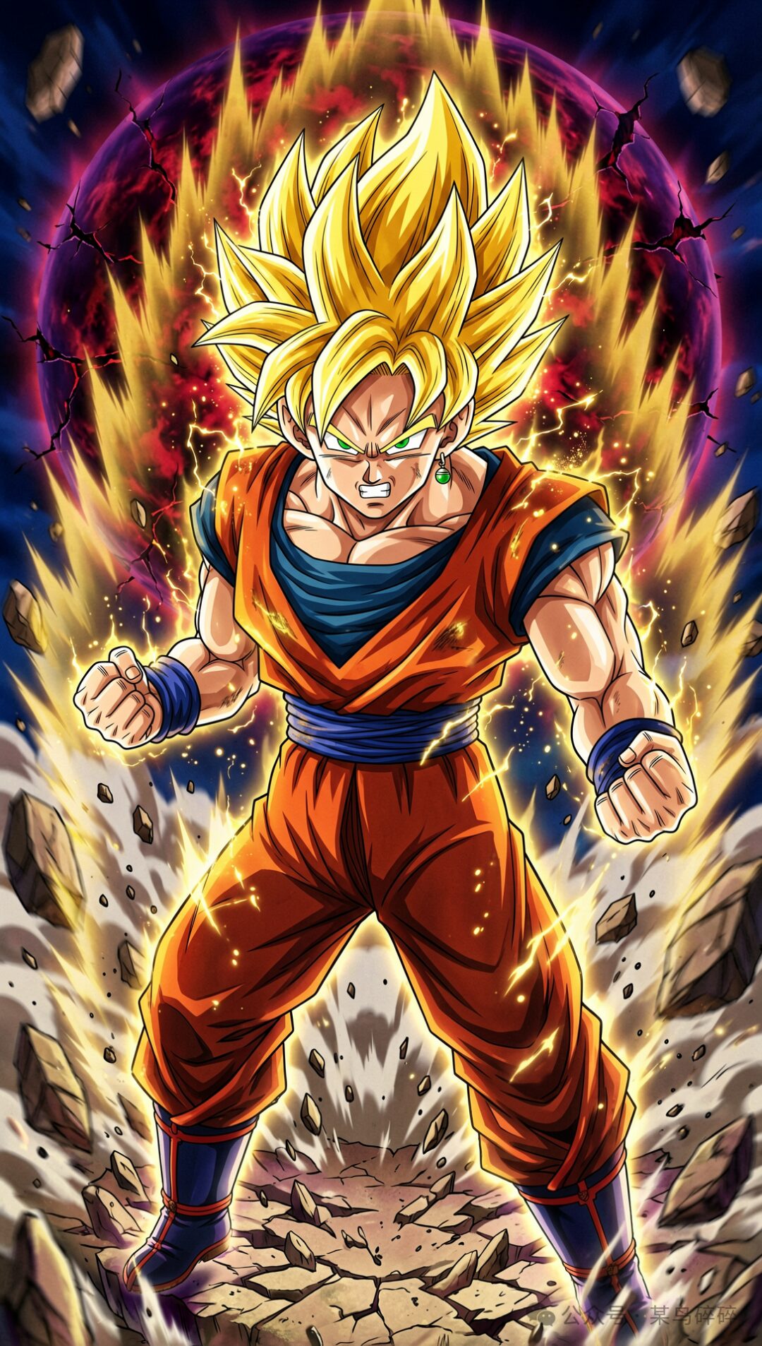
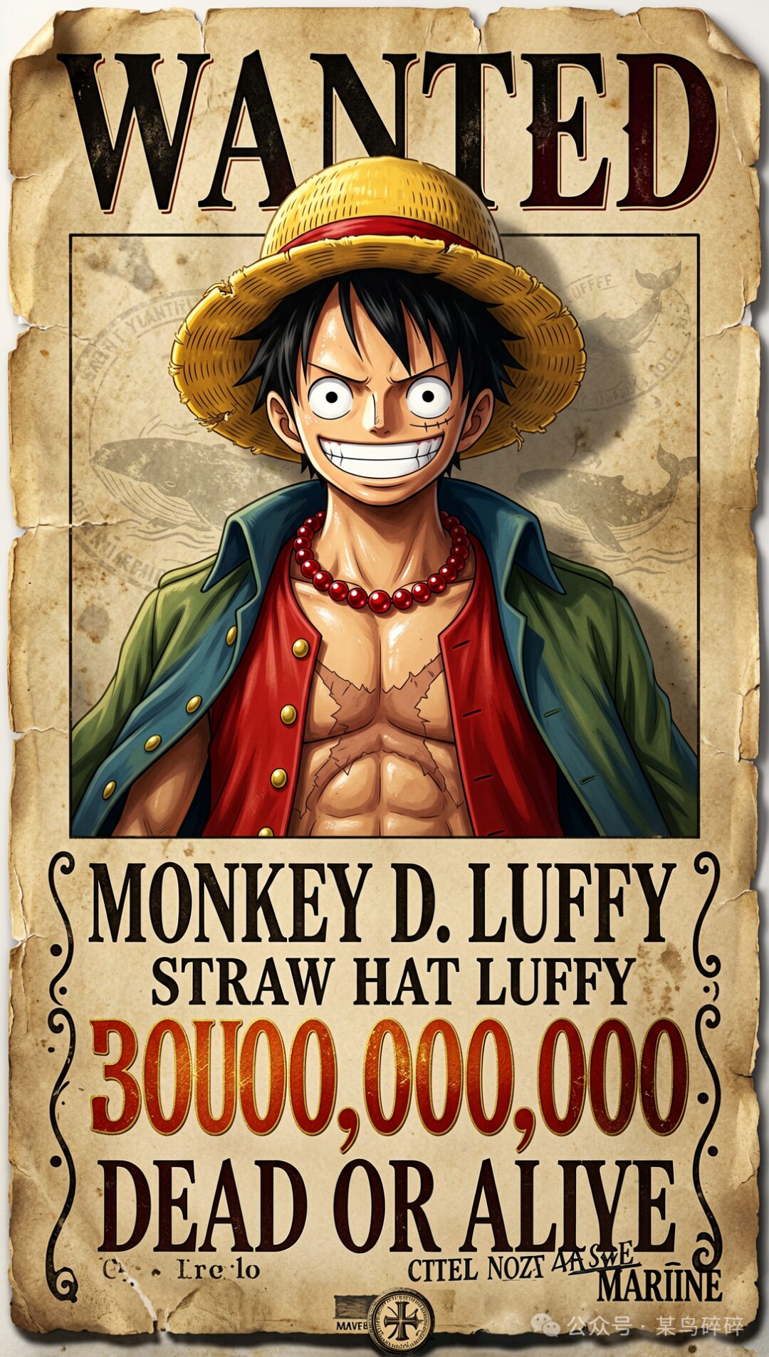
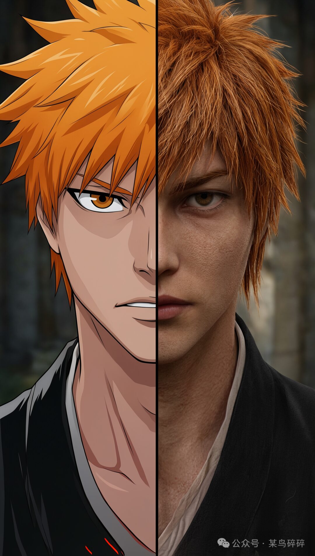
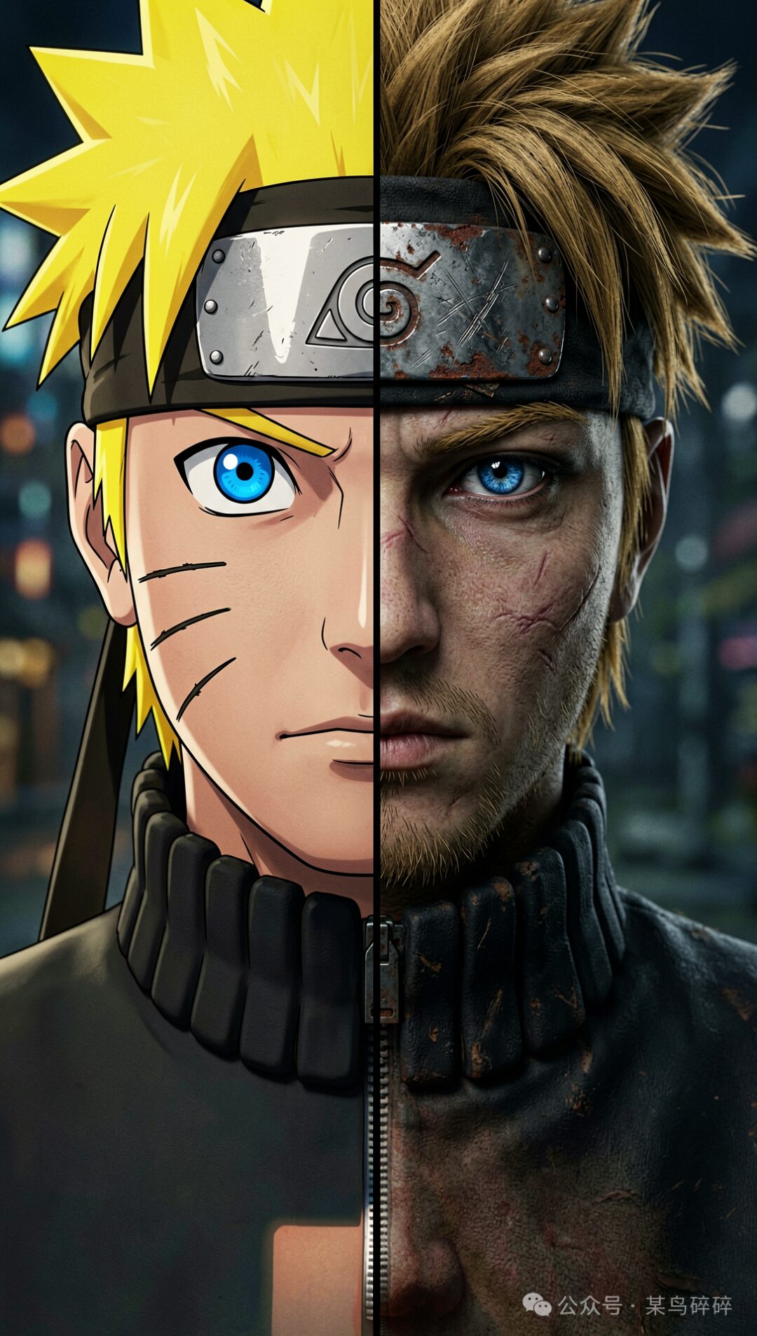
Comic-style character generation is definitely better than realistic character generation, but it still feels a little lacking in color layering.
Final Thoughts
Ernie-image has two versions: the original version needs 50 steps, while the distilled version (turbo) only needs 8 steps. There’s quite a big difference in output quality. The 50-step version needs more detailed descriptions, and its default generation style seems to lean more foreign-looking. The distilled version is slightly more Asian-leaning, but overall neither feels as visually pleasing as Z-Image / Qwen-Image.
That said, if you want to make design visuals, PPTs, and similar content, it’s still worth trying. But you really need to use the 50-step version, because once the turbo version has too much text, it is guaranteed to make mistakes...
Personally, I wasn’t surprised — if anything, I was a little disappointed...
If you want to try it yourself, you can go to the ModelScope community, search for Comfy-Org/ERNIE-Image, and download the model, text_encoder, vae (it uses Flux2’s VAE), and prompt-enhancer (required by the official ComfyUI template).